
Using the right data visualization techniques for graphical representation is vital in conveying complex ideas into digestible information. It facilitates communication and enables us to make informed decisions swiftly.
Imagine the overwhelming task of deciphering a spreadsheet filled with infinite numerical data. Now, contrast that with a well-organized chart employing data visualization techniques. The latter instantly reveals relationships, exploratory data analysis, data points, trends, and irregularities that would remain hidden in raw data.
But what if we take this a step further? What if we combined texts, images, and graphic elements into one compelling design?
This article explores the synergy between infographics and PDFs to transform your ideas into effective and visually appealing presentations.
What are Data Visualizations?
Data visualizations are graphical representations of data points and information. They use charts, graphs, maps, and network diagrams to present complex and unstructured data in a visually appealing and easy-to-understand format.
Utilizing data visualization provides a quick overview of large amounts of new and historical data, making it easier for people to spot patterns, trends, and relationships. In today's fast-paced world, where information overload is a common issue, data visualizations help to simplify complex concepts and make them more accessible to a wider audience.
Why Create PDF Infographics?
Infographics can incorporate various types of content, including different data visualization techniques and data distribution analysis. They often blend text with visual elements like statistical graphs, step-by-step diagrams, heat maps, word clouds, timelines, icons, or visual representation, making complex data more accessible and engaging.
Given their versatility, infographics require a widely accessible format to maintain the original layout and quality, which is essential for data analysts and data scientists. This is where PDF advantages outperform other file types in fulfilling this role. PDFs are:
Compact
They condense complex data into visually appealing designs using data visualization techniques without lowering the quality. This makes them ideal for sharing on multiple platforms, including social media and websites.
Additionally, PDFs can be easily downloaded and printed for offline use.
Engaging
PDFs support multimedia and interactive elements like buttons, hyperlinks, or 3D models, making the use of data visualization tools even more effective. This interactive feature makes the infographic more engaging and compelling for readers.
For example, using icons or illustrations can enhance the visual appeal of an infographic and make it more appealing to viewers.
Shareable
They are easily distributed via email, social media, or presentations, making them an effective tool for data visualization. This allows for a wider reach and increases the chances of sharing the infographic among a larger audience.
In turn, this can also lead to increased website traffic and brand awareness.
Accessible
They are suitable for professionals and students of all backgrounds and experience levels, particularly in the context of data visualization. This accessibility makes PDFs a versatile tool for various data science, industries, and fields, from marketing to education, enhancing their utility in presenting complex information visually.
Secure
With PDF, you can limit access to unauthorized viewers through password and signature protection, ensuring the safety and confidentiality of your data visualization content. Additionally, PDFs are less prone to viruses or malware compared to other file formats, making them a secure choice for sharing sensitive data visualization.
Additionally, PDFs are excellent for presenting data in an insightful, efficient, and comprehensive way.
Data Visualization Tools for Creating Engaging Infographics
Let’s start by exploring some common data visualization tools to make PDF infographics that stand out from the crowd. Don’t worry; you don’t have to be a pro or have the best data visualization skills to craft beautiful projects since most platforms offer ready-to-use templates and visual elements.
Canva
Canva, one of the leading data visualization tools, is popular among beginners and professionals since it has an intuitive and user-friendly interface. It offers free customizable templates, fonts, and images for your infographics and other data visualization methods.
It also allows team collaboration if you are working on a group project.
Piktochart
This data visualization tool is another excellent option for beginners interested in data visualization. It offers a variety of templates to kickstart your projects and allows you to easily import data from Excel or Google Sheets.
Piktochart also has a library of icons, images, and charts to enhance your infographics.
Infogram
Infogram is a robust data visualization tool that is ideal for those looking to create dynamic and interactive infographics. It supports real-time data, so your visuals can update automatically as the underlying hierarchical data changes. This feature is particularly valuable for displaying live statistics or trends.
Infograms interface is also user-friendly, allowing you to build engaging visuals with its rich set of templates, charts, and design elements.
PDF Conversion and Editing Tools
There are various online and downloadable data visualization tools for designing infographics using different data visualization techniques, but sharing them in their native format is impractical. In such cases, you can quickly convert your projects online to PDF using convertible tools like PDF Guru.
These data visualization tools are also perfect for minor revisions and edits since you don’t need to change the overall design.
Visualization Techniques for Simplifying Complex Data
Effective data visualization techniques play a crucial role in conveying information in an engaging and simple way. Data analysts use different data visualization techniques, such as plots, charts, diagrams, and maps, to translate complex data and relations in a simple way, making data understandable and unlocking its full potential.
Each data on the chart represents a single data point and is used as a data visualization technique to analyze the relationship and correlation between two variables. Analyzing data points' distribution helps find central tendencies, understand data spread, identify relationships between variables, and detect outliers.
Additionally, understanding the various types of data visualization techniques is essential for effective data communication.
Here are some basic tips to avoid such issues in your infographics.
- Use clear and concise titles and labels for your data visualization.
- Choose the right data visualization technique, such as a line chart, to track changes in data over time and compare multiple data series.
- Ensure your data is accurate and up-to-date.
- Use scatter plots to illustrate relationships, identify trends, and detect correlations in fairly large data sets.
For those looking to delve further into data visualization and analysis, there are excellent online platforms offering comprehensive paths. Considering the relation between utilizing visual tools and understanding underlying data points is crucial. Platforms that provide resources for data analysis learning ensure that budding analysts can learn techniques using real-world data sets.
Identify the Right Chart Types
Selecting the right chart type is pivotal when using a data visualization tool, as charts are important elements of PDF infographics and embody a key data visualization technique. The design depends on the characteristics of the data points you wish to emphasize and focus on.
There are various shapes and forms, but the most common ones are:
Bar Charts
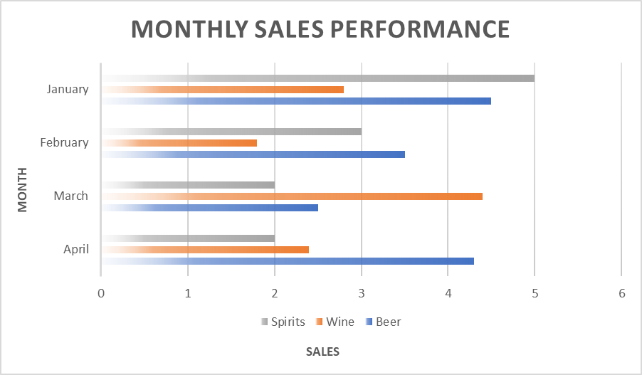
Bar charts are essential in data visualization for comparing data across categories. Each bar's height or length corresponds to the values it represents, enabling straightforward comparisons.
Bar charts can be oriented horizontally or vertically and are ideal for illustrating variations in data, like sales across regions or survey responses. They often use color coding to differentiate categories and enhance visual clarity.
Their simplicity ensures that viewers can quickly grasp key differences and trends, making bar charts a preferred choice for presenting categorical data in an easily digestible format.
Line Charts
A Line Chart is an example of data visualization. It is ideal for tracking patterns or trends over continuous intervals, analyzing trends, comparing multiple data series, and presenting changes over set periods with more than a small handful of insights.
Line charts are one of the useful and popular data visualization techniques for looking at stock market trends or website traffic over a period of time.
Pie Charts
Pie Charts are perfect for displaying percentages, fragments, and pieces of a whole type of data. For example, a pie chart could show the different types of traffic sources for a website. This can help identify which source brings in the most traffic and where improvements can be made.
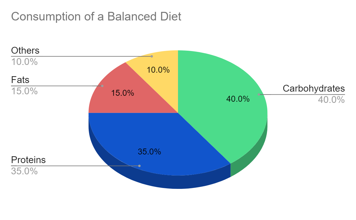
In our consumption of a balanced diet, we can see that 40% of the diet should come from carbohydrates, followed by 35% from proteins and 15% from fats. The remaining 10% is from other sources.
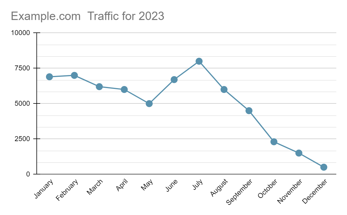
Line Graphs
On the other hand, line graphs are great for showing trends over time. For our sample website, a line graph can display how its overall traffic has fluctuated throughout the year 2023. By using this graph, we can easily identify any spikes or drops in traffic and analyze what factors may
Scatter Plot
A scatter plot is a type of data visualization that uses dots to represent the values obtained for two different variables - one plotted along the x-axis and the other plotted along the y-axis. This graph is particularly useful for showing the relationship between the two variables, comparing categorical data, and allowing observers to discern patterns or correlations at a glance.
Reduce Data Clutter
Filtering the most critical data is not easy, especially in the context of data visualization. In our effort to present information in an appealing and memorable way, we often lose track of our primary goal: simplicity.
Finding the right balance between layout and crucial information ensures our message remains clear, coherent, and impactful in data visualization. This principle applies to all documents, including infographics (PDF or any other format).
Avoid Overcrowding
Stick to simple sentences and short labels in your data visualization. Long and descriptive axis titles, for example, can make it harder for readers to understand what you’re describing. Instead, use clear and concise language that easily conveys your message.
Remove Unnecessary Elements
In data visualization, legends, gridlines, or tickmarks can be excessive or redundant for viewers, preventing them from spotting important data. Consider removing or minimizing these elements to focus on the key information.
Let’s look at the sample map infographic below.
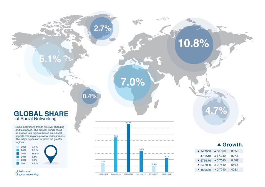
It presents the percentage growth of the Global Share of Social Networking for each continent. As such, additional details like country names or their capitals are not mentioned since they are unimportant.
Control Color and Contrast
Colors can be a powerful tool or destructive chaos if misused in data visualization. When deciding on the palette, make sure to:
- Use a limited palette: Applying more than 5 colors could break the harmony and overwhelm your audience.
- Maintain readability: Ensure sufficient contrast between text and background (e.g., light text on a dark background or vice versa).
- Consider visual limitations: Avoid problematic color combinations by replacing them with symbols and icons or using color-blind-friendly palettes.
- Set the right tone: Colors express different emotions, so pick them wisely. Red and orange radiate energy, while blue or green are cool and calm.
Group and Organize Data
Much like a skeleton, hierarchically organizing all pieces of information using a data visualization technique can guide readers through the flow of our thoughts. Thus, it’s worth drafting a layout before rushing to create PDF files with little value.
Whatever data visualization project you are working on, group and nest related data logically. Additionally, consider applying visual representation hierarchy, such as using a larger font or bold text to highlight your key points. These data visualization techniques enhance clarity and effectiveness in conveying your message.
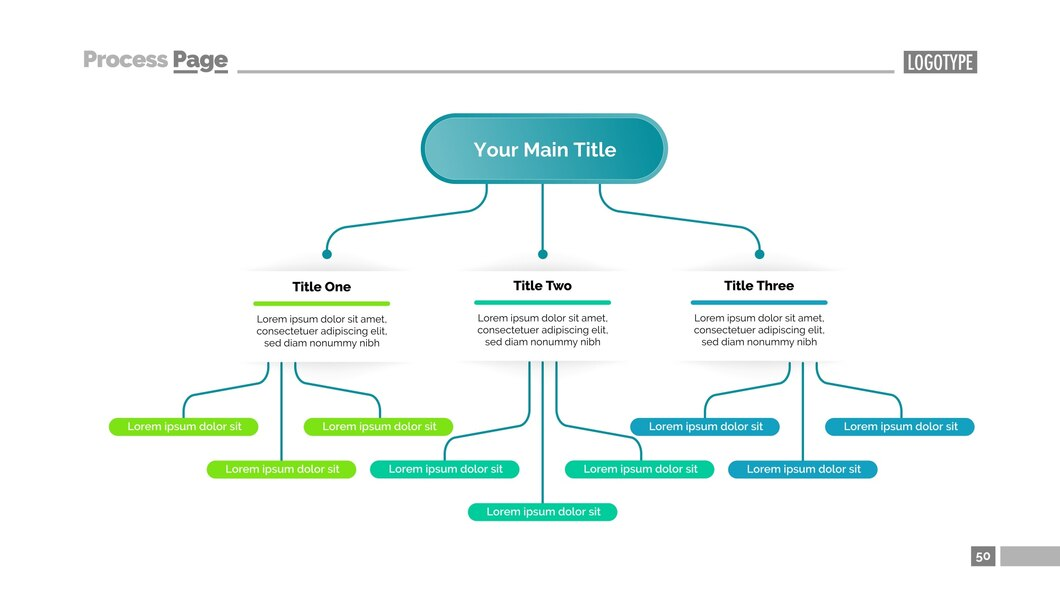
Tree Chart template by Katemangostar on Freepik
Final Thoughts on Data Visualization Techniques
All in all, data visualization techniques such as infographics are a powerful tool for both businesses and individuals.
By utilizing visuals to communicate complex data, we can turn mundane information into an exciting and engaging experience. Infographics serve not only as a means of simplifying data but also as a way to uncover hidden patterns or trends that may have otherwise gone unnoticed.
And, with the ability to convert them to PDF format, we can ensure their compatibility across platforms, as well as maintain their high quality and security for long-term use. So the next time you come across a mountain of data, don't shy away from it - embrace it and let infographics be your guide to turning information into valuable insights.
With infographics by your side, you'll be able to conquer any data challenge with ease and creativity. As they say, "a picture is worth a thousand words," and in the world of data visualization, that couldn't be more true.
So go forth and create visually stunning infographics that will not only inform but captivate your audience as well!
About the author: Julian Wasser
Julian is a valuable PDF Guru member who seeks to enhance PDF user-friendliness through helpful and concise content. His commitment to simplicity and efficiency transforms PDF navigation into a breeze for his readers.